

Два эффекта при наведении на картинку с появлением текста. Для удобства копирования в каждую вкладку CSS добавлены общие стили. Эти эффекты можно использовать для галереи и для карточек товаров.
Пример
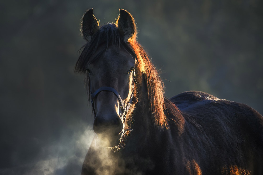
Lorem ipsum
Lorem ipsum dolor sit amet, consectetur adipiscing elit
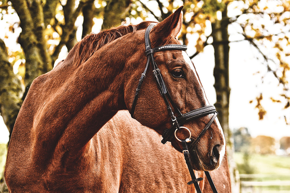
Lorem ipsum
Lorem ipsum dolor sit amet, consectetur adipiscing elit
HTML
<!-- Первая картинка -->
<div class="hover-text-one">
  <figure class="effect-text-two">
    <img src="image.jpg" alt=""/>
      <figcaption>
	<h3>Lorem <span>ipsum</span></h3>
	<p>Lorem ipsum dolor sit amet, consectetur adipiscing elit</p>
      </figcaption>
  </figure>
</div>
<!-- Вторая картинка -->
<div class="hover-text-one">
  <figure class="effect-text-one">
    <img src="image.jpg" alt=""/>
      <figcaption>
	<h3>Lorem <span>ipsum</span></h3>
	<p>Lorem ipsum dolor sit amet, consectetur adipiscing elit</p>
      </figcaption>
   </figure>
</div>
CSS 1
/* Общие стили */
*, *:after, *:before {
	border-box;
	box-sizing: border-box;
}
.clearfix:before, .clearfix:after {
	content: '';
	display: table;
}
.clearfix:after {
	clear: both;
}
.hover-text-one {
	overflow: hidden;
	margin: 0;
	width: 100%;
	list-style: none;
	text-align: center;
}
.hover-text-one figure {
	position: relative;
	z-index: 1;
	display: inline-block;
	overflow: hidden;
	background: #527c82;
	text-align: center;
	cursor: pointer;
}
.hover-text-one figure img {
	position: relative;
	display: block;
	min-height: 100%;
	opacity: 0.8;
}
.hover-text-one figure figcaption {
	padding: 2em;
	color: #fff;
	text-transform: uppercase;
	font-size: 1.25em;
	-webkit-backface-visibility: hidden;
	backface-visibility: hidden;
}
.hover-text-one figure figcaption::before,
.hover-text-one figure figcaption::after {
	pointer-events: none;
}
.hover-text-one figure figcaption{
	position: absolute;
	top: 0;
	left: 0;
	width: 100%;
	height: 100%;
}
.hover-text-one figure h3 {
	word-spacing: -0.15em;
	font-weight: 300;
}
.hover-text-one figure h3 span {
	font-weight: 800;
}
.hover-text-one figure h3,
.hover-text-one figure p {
	margin: 0;
}
.hover-text-one figure p {
	letter-spacing: 1px;
	font-size: 68.5%;
}

/* Эффект при наведении */
figure.effect-text-two figcaption::before {
	position: absolute;
	top: 0;
	left: 0;
	width: 100%;
	height: 100%;
	background: -webkit-linear-gradient(top, rgba(72,76,97,0) 0%, rgba(72,76,97,0.8) 75%);
	background: linear-gradient(to bottom, rgba(72,76,97,0) 0%, rgba(72,76,97,0.8) 75%);
	content: '';
	opacity: 0;
	-webkit-transform: translate3d(0,50%,0);
	transform: translate3d(0,50%,0);
}
figure.effect-text-two h3 {
	position: absolute;
	top: 50%;
	left: 0;
	width: 100%;
	color: #f66d52 !important;
	-webkit-transition: -webkit-transform 0.35s, color 0.35s;
	transition: transform 0.35s, color 0.35s;
	-webkit-transform: translate3d(0,-50%,0);
	transform: translate3d(0,-50%,0);
}
figure.effect-text-two figcaption::before,
figure.effect-text-two p {
	-webkit-transition: opacity 0.35s, -webkit-transform 0.35s;
	transition: opacity 0.35s, transform 0.35s;
}
figure.effect-text-two p {
	position: absolute;
	bottom: 0;
	left: 0;
	padding: 2em;
	width: 100%;
	opacity: 0;
	-webkit-transform: translate3d(0,10px,0);
	transform: translate3d(0,10px,0);
}
figure.effect-text-two:hover h3 {
	color: #fff;
	-webkit-transform: translate3d(0,-50%,0) translate3d(0,-40px,0);
	transform: translate3d(0,-50%,0) translate3d(0,-40px,0);
}
figure.effect-text-two:hover figcaption::before ,
figure.effect-text-two:hover p {
	opacity: 1;
	-webkit-transform: translate3d(0,0,0);
	transform: translate3d(0,0,0);
}
CSS 2
/* Общие стили */
*, *:after, *:before {
	border-box;
	box-sizing: border-box;
}
.clearfix:before, .clearfix:after {
	content: '';
	display: table;
}
.clearfix:after {
	clear: both;
}
.hover-text-one {
	overflow: hidden;
	margin: 0;
	width: 100%;
	list-style: none;
	text-align: center;
}
.hover-text-one figure {
	position: relative;
	z-index: 1;
	display: inline-block;
	overflow: hidden;
	background: #527c82;
	text-align: center;
	cursor: pointer;
}
.hover-text-one figure img {
	position: relative;
	display: block;
	min-height: 100%;
	opacity: 0.8;
}
.hover-text-one figure figcaption {
	padding: 2em;
	color: #fff;
	text-transform: uppercase;
	font-size: 1.25em;
	-webkit-backface-visibility: hidden;
	backface-visibility: hidden;
}
.hover-text-one figure figcaption::before,
.hover-text-one figure figcaption::after {
	pointer-events: none;
}
.hover-text-one figure figcaption{
	position: absolute;
	top: 0;
	left: 0;
	width: 100%;
	height: 100%;
}
.hover-text-one figure h3 {
	word-spacing: -0.15em;
	font-weight: 300;
}
.hover-text-one figure h3 span {
	font-weight: 800;
}
.hover-text-one figure h3,
.hover-text-one figure p {
	margin: 0;
}
.hover-text-one figure p {
	letter-spacing: 1px;
	font-size: 68.5%;
}

/* Эффект при наведении */
figure.effect-text-one img {
	width: -webkit-calc(100% + 50px);
	width: calc(100% + 100px);
	opacity: 0.7;
	-webkit-transition: opacity 0.35s, -webkit-transform 0.35s;
	transition: opacity 0.35s, transform 0.35s;
	transform: scale(1.2);
}
figure.effect-text-one figcaption {
	top: auto;
	bottom: 0;
	height: 50%;
	text-align: left;
}
figure.effect-text-one h3,
figure.effect-text-one p {
	-webkit-transform: translate3d(0,40px,0);
	transform: translate3d(0,40px,0);
}
figure.effect-text-one h3 {
	color: #f66d52 !important;
	-webkit-transition: -webkit-transform 0.35s;
	transition: transform 0.35s;
}
figure.effect-text-one p {
	background: rgba(0,0,0,0.6);
	color: #fff;
  padding: 10px;
  opacity: 0;
  -webkit-transition: opacity 0.2s, -webkit-transform 0.35s;
  transition: opacity 0.2s, transform 0.35s;
}
figure.effect-text-one:hover img,
figure.effect-text-one:hover p {
	opacity: 1;
}
figure.effect-text-one:hover img,
figure.effect-text-one:hover h3,
figure.effect-text-one:hover p {
	-webkit-transform: translate3d(0,0,0);
	transform: translate3d(0,0,0);
}
figure.effect-text-one:hover p {
	-webkit-transition-delay: 0.05s;
	transition-delay: 0.05s;
	-webkit-transition-duration: 0.35s;
	transition-duration: 0.35s;
}